Outliers
In the early stages of visualizing the data–moving the sliders–it became obvious that there were some extreme observations among the counties. The sliders were set to values that represented either the 2.5% or the 97.5% percentile. Upon further reflection, one or the other values may have been eliminated depending on the variable. For example, counties could have too few primary care physicians but it was doubtful that a county could have too many. The initial starting points can be adjusted by the user, but seeing the actual distribution prior to adjusting the sliders might be helpful.
is_outlier <- function(x) {
        return(x < quantile(x, 0.25) - 1.5 * IQR(x) | x > quantile(x, 0.75) + 1.5 * IQR(x))
}
df <- retirementLoc |>
      select(fips, pop_2020, pct_pop_change, partisan_lean:prim_care_dr_rate) |>
      mutate(across(pop_2020:prim_care_dr_rate, scale)) |>
      pivot_longer(!fips, names_to = c("key"), values_to = "value") |>
      drop_na() |>
      group_by(key) |>
      mutate(outlier = ifelse(is_outlier(value), value, as.numeric(NA)))
p <- ggplot(df, aes(x = value, y = factor(key))) +
      scale_y_discrete(name = "") +
      geom_boxplot() +
      ggtitle("RetirementLoc Outliers")
p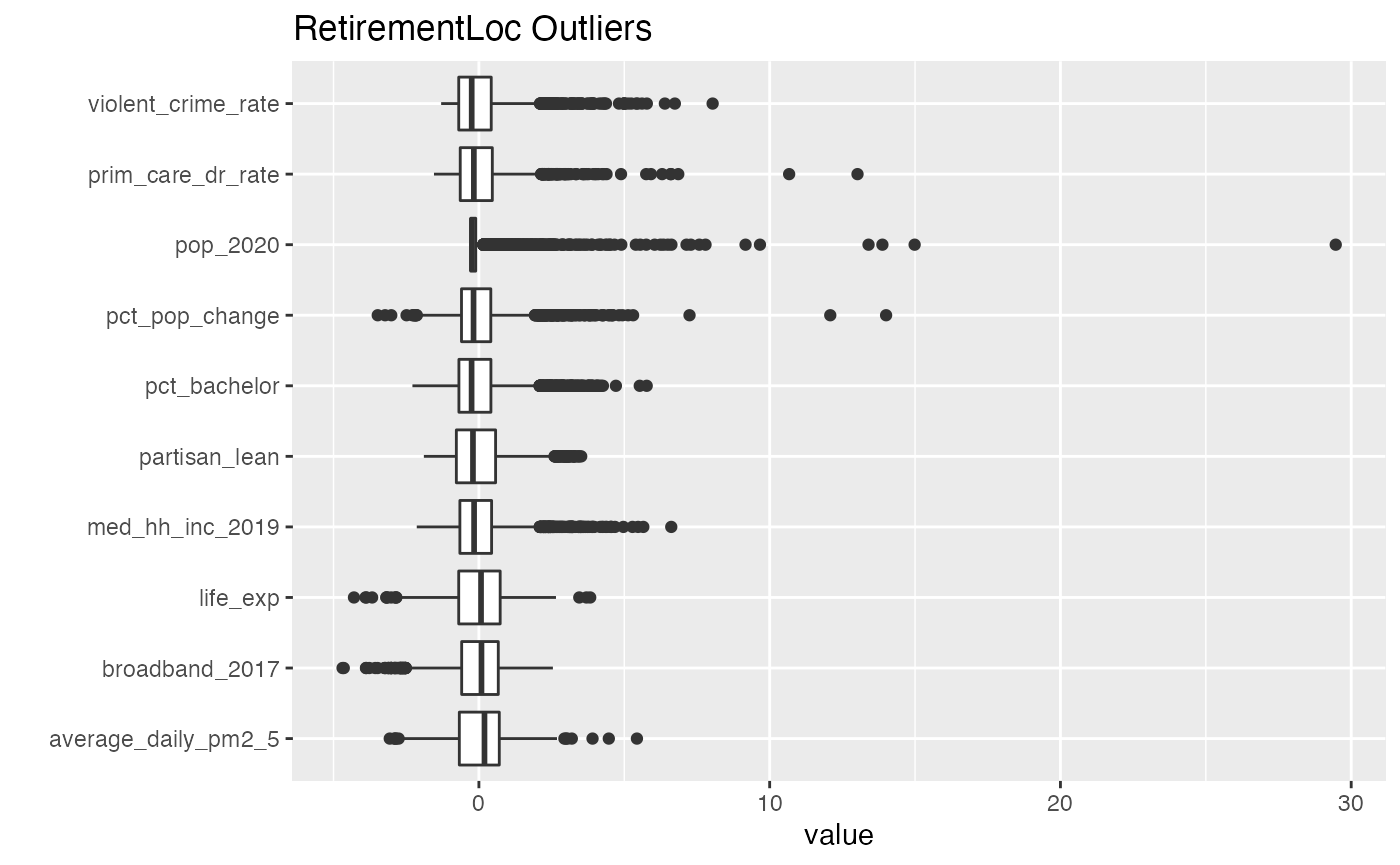
Data was scaled for comparisons using \((x - mean(x)) / sd(x)\).