Maps
1 Inspiration
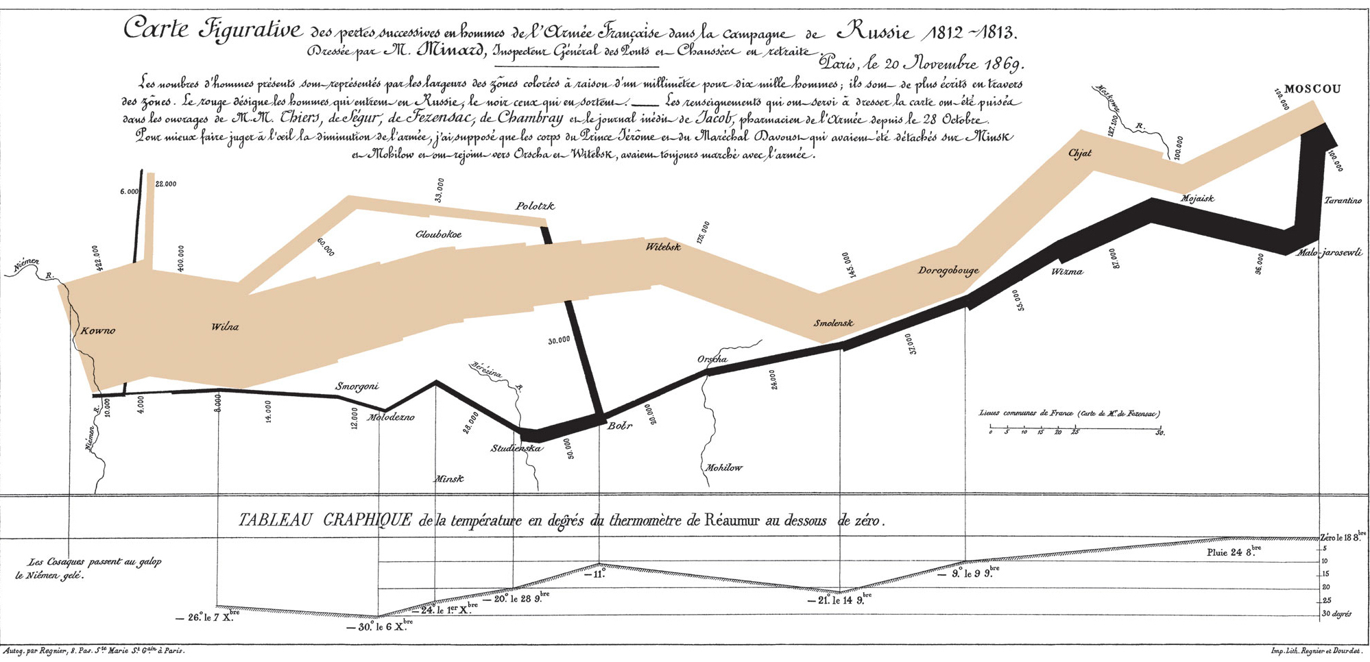
Good maps inspire, provide insight and are aethetically pleasing. The above map drawn by Charles Joseph Minard in 1869–long before the advent of the pixel– meets those criteria. Renowned Yale professor, artist and visualization afficianado Edward Tufte incorporated the map in his book “The Visual Display of Quantitative Information.(Tufte, 2001)
The map is simple in presentation but gobsmackingly clear in its insight: an army that began with 422,000 returned with 10,000 men. A less creative author could have shown the size of Napoleon’s army on one axis and time on the other. Instead, Minard’s map includes six variables: the size of the army, its location in two coordinates, direction of the army’s movement, and temperature on various dates. Tufte noted that “[i]t may well be the best statistical graphic ever drawn.”(Tufte, 2001)
2 Purpose
Plots should be created with the end in mind. The first question should be: what is the plot’s ultimate purpose? Interim plots to guide discovery and workflows are not prepared with the same deliberation and detail that a plot for a respected academic journal would be. Within the R universe, there is a distinction made between quick plots and publication-ready plots. For example, the ggplot2 package furnishes qplot() for quick plots and ggplot() for more fine-tuning. The tmap package allows for qtm() quick plots and tm_polygon() for more detail.
3 Static vs. Interactivity
A second question, which is related to the first, is whether the map should be static or allow for interactivity with the user. An example of static maps is the old-fashioned, “Rand-McNally” atlas that could be found on the coffee tables of yore. The atlas could be used to find a place and its location, but the user’s experience ended there. With the growth of the internet and the ubiquity of java script and D3, map interactivity is quickly becoming the default and the de facto standard in digital cartography.
4 Suitability
The answers to these questions will direct the author to the correct methods. However, in the evolution of a project, the author will need to know all of the packages. The typical project will require quick plotting as data is explored, more polished plots as the results are shared with colleagues, and interactivity for web-based plots. The R universe is suitable for authors’ diverse requirements. The base plotting functions allow for quick plotting; ggplot2 and tmap can produce publication-level plots; and shiny and leaflet can allow for interactivity.
Tufte, E. R. (2001). The Visual Display of Quantitative Information (Second edition). Cheshire, Conn. : Graphics Press. https://www.edwardtufte.com/tufte/books_vdqi