colorspace package.
The viewer will be able to choose sequential, diverging and qualitative color palettes for maps using the colorspace package.
Your efforts will garner more views if you make the content accessible. Colors can be an important part of the effort because colorblindness affects about 8% of males and .5% of females. Government sponsored content requires that accessibility standards be met. For example, accessibility is required by law for all (U.S.) federal information and communication technology products with a few minor exceptions.(GSA 18F, 2024). The European Union adopted web accessibility standards in 2016 which became effective in 2021.(European Union, 2016) The premier standard for accessibility is the Web Content and Accessibility Guidelines.(Web Content Accessibility Guidelines (WCAG) 2.0, 2008) The bottom line is that there are “colorblind friendly” palettes available and they should be used.
Users should select a color palette from a proven package. The overwhelming consensus is that those lacking design experience should “instead draw from preconstructed ramps.” (Smart et al., 2020) The good news is that “automatically generated color ramps” can perform at least as well as designer ramps in many circumstances. (Smart et al., 2020) Several excellent packages are available: RColorBrewer, colorspace and rcartocolor to name a few. There are also a couple of packages that aggregate palettes: pal and paletteer.
In addition to the previous discussion on map aesthetics, some basic color observations are in order. An appropriate color selection should accomplish three things. First, the colors should not be unappealing. (Zeileis et al., 2019) Large areas of highly saturated colors should be avoided as viewers quickly tire and it can cause after-image effects.(Zeileis et al., 2019) Second, the colors should “cooperate” with each other, meaning that any one color should both be appealing by itself and when viewed with the others. (Zeileis et al., 2019) Third, “the colors should work everywhere”. (Zeileis et al., 2019) The colors should be distinguishable regardless of how they are displayed. The plot should convey the same meaning if it’s shown on a projector, a computer screen or a facsimile.
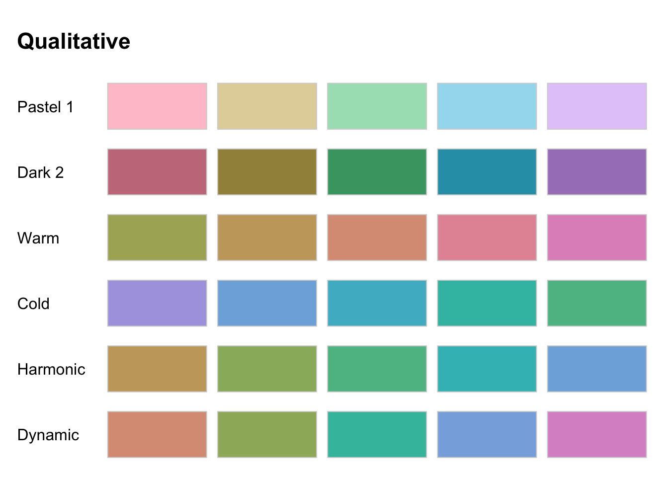
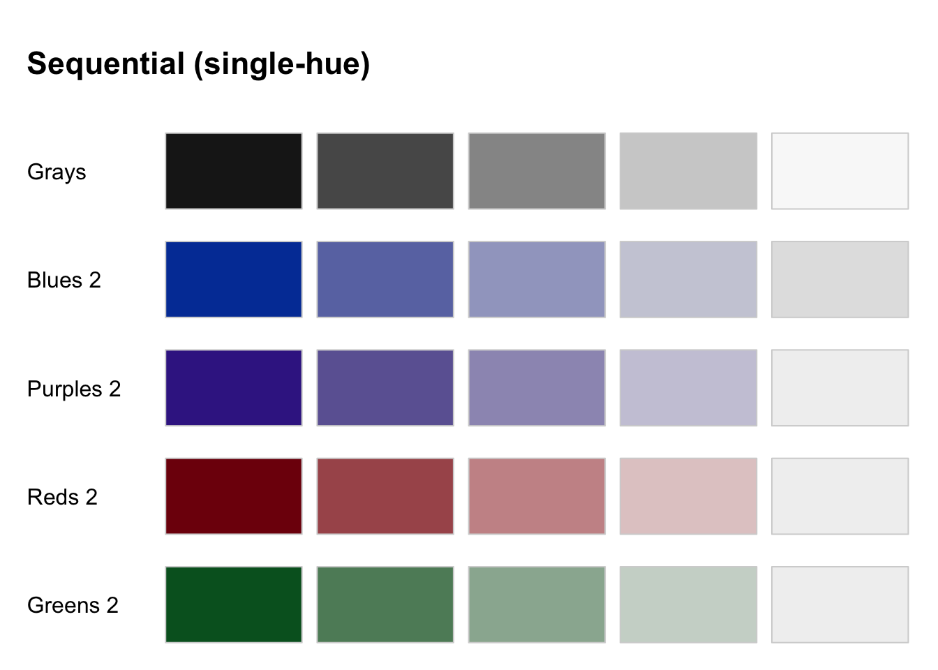
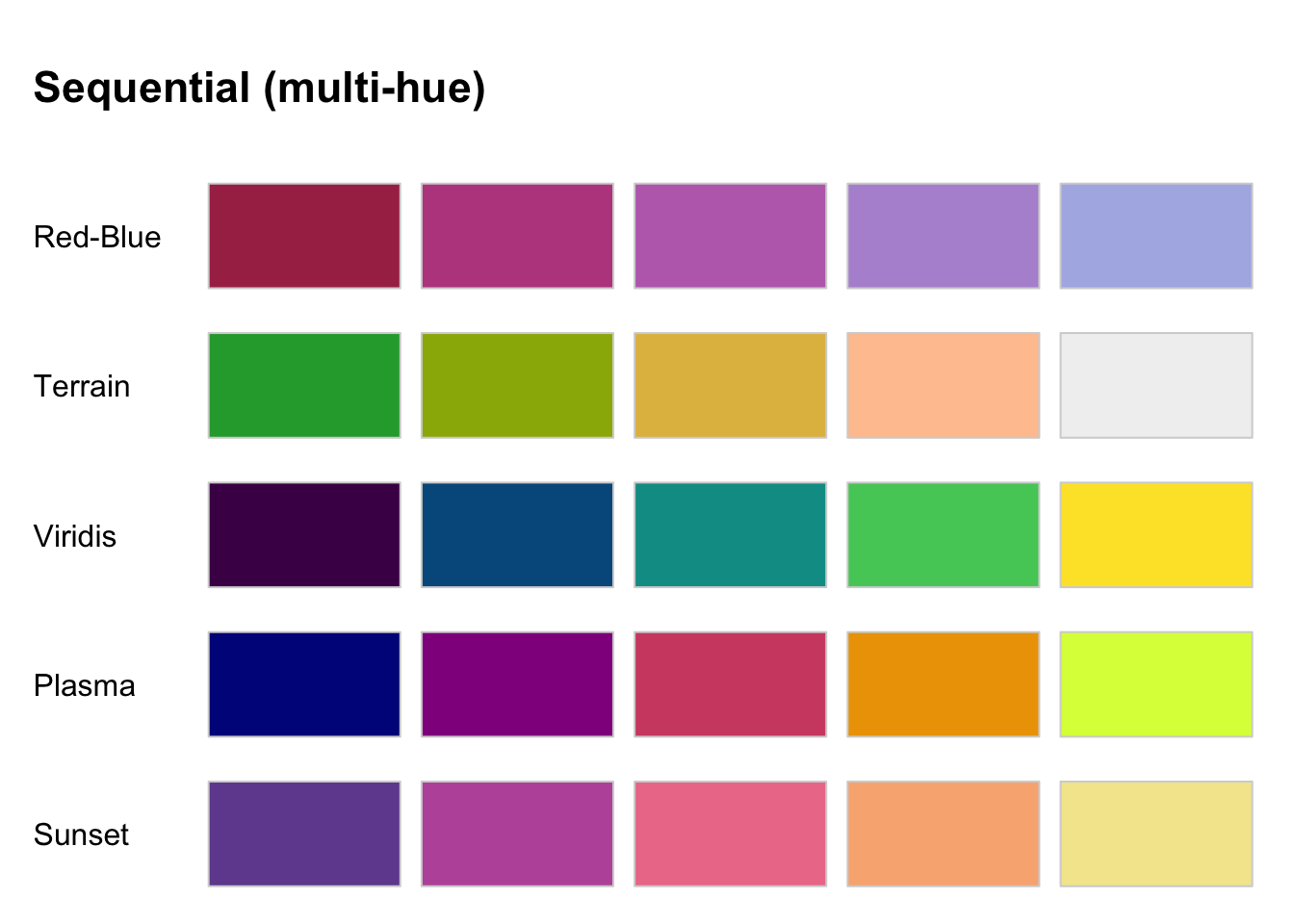
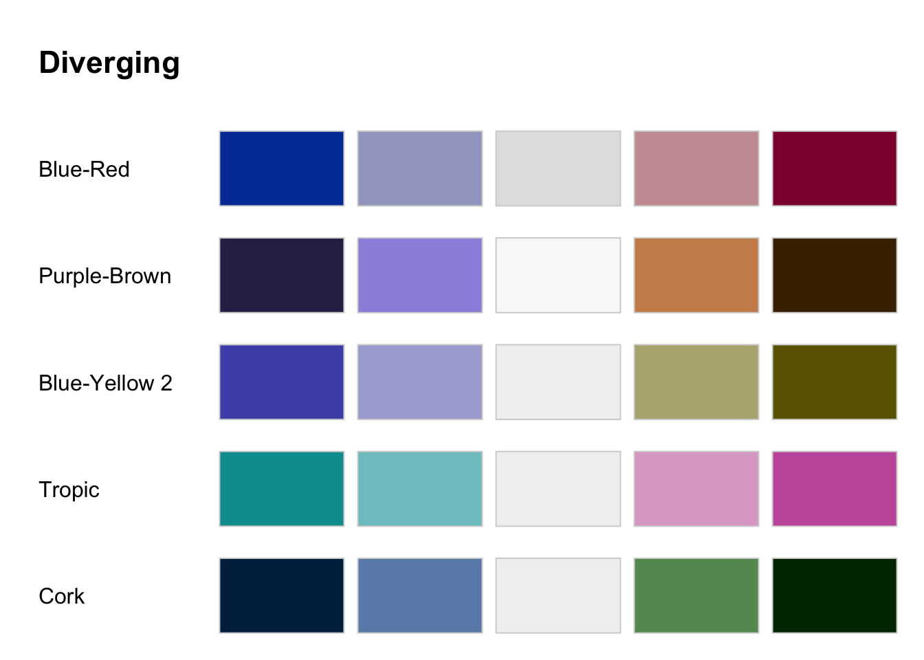
Colors are organized in three ways depending on the data type:
Qualitative palettes are used for categorical data “where no particular ordering of catgories is available and every color should receive the same perceptual weight.”
Sequential palettes are used for “coding ordered/numeric information where colors go from high to low or vice versa.”
Diverging palettes are “designed for coding numeric information around a central neutral value.” Their use shows contrasts between two extremes.
Here, we will limit the number of palettes. The color palettes within the colorspace package will be the default and we will try to limit colors to only 5 or so on the maps. If you’d like to view all of the palettes, you can run hcl_palettes(plot = T).
colorspace package.
colorspace package.
colorspace package.
colorspace package.
Within the ggplot2 framework, the colorspace syntax follows the form: “<scale_<aesthetic>_<datatype>_<colorscale>(), where <aesthetic> is the name of the aesthetic (fill, color, colour), <datatype> is the type of the variable plotted (discrete or continuous) and <colorscale> sets the type of the color scale used (qualitative, sequential, diverging, divergingx).”
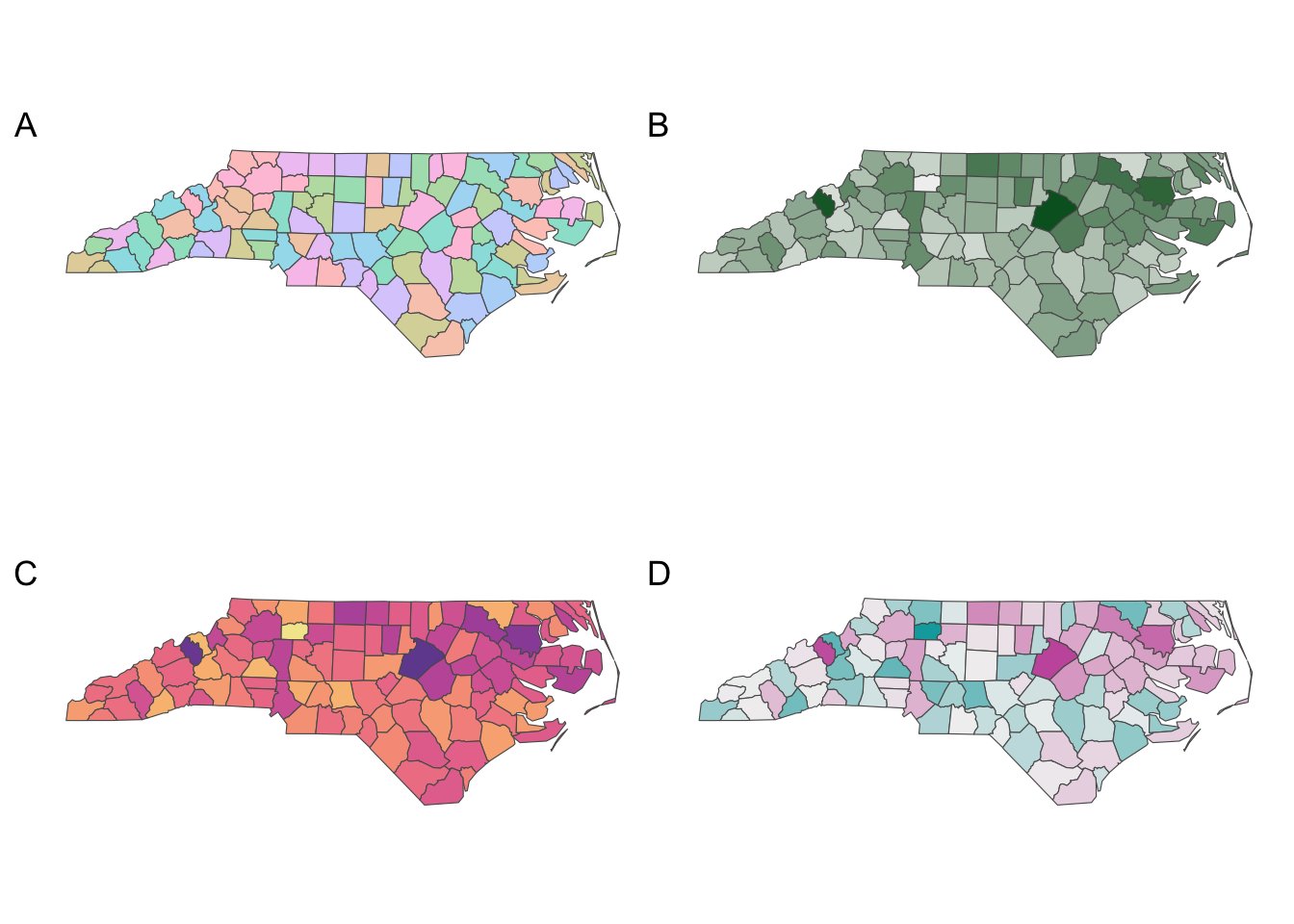
colorspace palette applied to the sf nc dataset. ‘A’ is a ‘Pastel 1’ palette applied to a qualitative variable; ‘B’ is a ‘Greens 2’ palette applied to a continuous variable; ‘C’ is the ‘Sunset’ multi-hue palette applied to a continuous variable; and ‘D’ is a the diverging palette ‘Tropic’ applied to a continuous variable.Choose color ramps from proven packages
colorspace is the preferred package for all color requirements
Qualitative palettes are used for categorical data
Sequential palettes are used for ordered/numeric information
Diverging palettes show contrasts between two extremes
In ggplot2, the syntax is <scale_<aesthetic>_<datatype>_<colorscale>()