Mapview
1 Objective
The objective for this section is to introduce the mapview package.
2 Introduction
Why mapview? There are a number of choices. tmap , mapview, mapdeck, leaflet, and googleway provide interactivity. However, mapview is designed to produce default maps with very little code. In fact, an interactive map can be generated with a single line of code. While the package is a wrapper around leaflet, it can be distinguished by its simplicity, ease of use, and scalability. Leaflet works really well with small datasets but stumbles with large ones. Leaflet code is also verbose when compared to mapview. For example, mapview will just generate legends without having to define them. There are three rendering engines in mapview: leaflet, leafgl, and mapdeck. And latency is not a problem for large datasets when the rendering engine is set to leafgl or mapdeck. “By default, mapview uses the leaflet JavaScript library to render the output maps, which is user-friendly and has a lot of features. However, some alternative rendering libraries could be more performant (work more smoothly on larger datasets). mapview allows the user to set alternative rendering libraries (”leafgl” and “mapdeck”) in the mapviewOptions()” (Lovelace et al., 2019).
The mapview documentation can be found here. Additionally, its author, Tim Appelhans, presented at the OpenGeoHub conference and the code can be found here and here. This section incorporates some of the examples from the vignettes and from his presentation.
3 Packages Required
4 Basic Plot
The first default plot is rendered with a simple invocation of the main function mapview. The center of the plot is in the building where the package was developed in Biegenwiertel, Germany. The layers icon allows the user to select among five basemaps.
The franconia dataset which ships with the mapview package is a simple dataset of the Franconia region in Germany. The dataset is used for the polygon and fill aspects of the mapping examples.
The breweries dataset also ships with the mapview package. The dataset is a simple dataset of breweries in the Franconia region in Germany. The dataset is used for the “points” examples. Clicking on the points will show the full table.
4.1 Layers
zcol creates a separate layer for each column specified.
4.2 Styling Options
The three most basic options for styling are color, col.regions, and alpha.regions. The color argument sets the color of the border, the col.regions argument sets the color of the fill, and the alpha.regions argument sets the transparency of the fill.
Below the breweries dataset is shown so the column types can be observed.
dplyr::glimpse(breweries)
#> Rows: 224
#> Columns: 9
#> $ brewery <chr> "Brauerei Rittmayer", "Brauhaus Leikeim", "Ammer…
#> $ address <chr> "Aischer Hauptstrasse 5", "Gewerbegebiet 4", "Ma…
#> $ zipcode <chr> "91325", "96264", "90614", "97688", "97450", "91…
#> $ village <chr> "Adelsdorf", "Altenkunstadt", "Ammerndorf", "Bad…
#> $ state <fct> Bayern, Bayern, Bayern, Bayern, Bayern, Bayern, …
#> $ founded <dbl> 1422, 1887, 1730, NA, 1885, 1886, 1867, 2004, 16…
#> $ number.of.types <dbl> 2, 11, 10, 6, 5, 7, 8, 3, 5, 5, 3, 5, 4, 6, 4, 2…
#> $ number.seasonal.beers <dbl> 1, 1, 0, 0, 0, 0, 0, 3, 0, 1, 2, 2, 1, 3, 4, 0, …
#> $ geometry <POINT [°]> POINT (10.9 49.7), POINT (11.2 50.1), POIN…The zcol argument can be used to set the color of the points. The at argument can be used to set the intervals. Here, the breaks were created for illustration only. The layer.name argument can be used to set the label.
mapview(breweries, zcol = "founded",
layer.name = "Year of <br> of founding:",
at = c(0, 1700, 2100))The plot below shows only the most basic attributes.
4.3 Color Polygons
Coloring polygons is accomplished through the colorRampPalette function. The colorspace package is used to select the color palette.
4.4 Operators
Multiple datasets can be added to a single layer via the “+” operator.
The pipe “|” operator allows for the screen to be split between the two datasets. This can be particulary effective to show changes in time like “before” and “after”.
4.5 Bursting Layers
Bursting layers is a feature that allows for all columns to be plotted. This can be helpful when looking for outliers among many columns.
4.6 Options
Below are the options that can be set. The “platform” argument can be helpful for large datasets.
mapviewOptions()
#>
#> global options:
#>
#> platform : leaflet
#> basemaps : CartoDB.Positron CartoDB.DarkMatter OpenStreetMap Esri.WorldImagery OpenTopoMap
#> basemaps.color.shuffle : TRUE
#> raster.palette : function (n)
#> vector.palette : function (n)
#> verbose : FALSE
#> na.color : #BEBEBE80
#> legend : TRUE
#> legend.opacity : 1
#> legend.pos : topright
#> layers.control.pos : topleft
#> leafletWidth :
#> leafletHeight :
#> viewer.suppress : FALSE
#> homebutton : TRUE
#> homebutton.pos : bottomright
#> native.crs : FALSE
#> watch : FALSE
#>
#> raster data related options:
#>
#> raster.size : 8388608
#> mapview.maxpixels : 5e+05
#> plainview.maxpixels : 1e+07
#> use.layer.names : FALSE
#> trim : TRUE
#> method : bilinear
#> query.type : mousemove
#> query.digits : 3
#> query.position : topright
#> query.prefix : Layer
#> georaster : FALSE
#>
#> vector data related options:
#>
#> maxpolygons : 30000
#> maxpoints : 20000
#> maxlines : 30000
#> pane : auto
#> cex : 6
#> alpha : 0.9
#> fgb : FALSETo reset the options, the default option can be set to TRUE.
4.7 leafgl
In the video tutorial, the creator showed how mapview performs with large datasets. I set up the code on my local machine and it was amazing with 500k points. I omitted the code and plot here because object size was 650 MB.
5 Atlanta
Here is the atlanta dataset from the mapswrData package. The dataset is an sf class object, meaning the polygons are a part of the dataset. The Atlanta Metropolitan Statistical Area (MSA) is a 5-county region that includes the city of Atlanta, Georgia. The dataset was created using the tidycensus package and includes three variables, aside from identifiers: estimated median age, percent of the population having a bachelor’s degree or higher, and the percent of the population above the age of 18 that formerly served in the U.S. military.
atlanta %>%
dplyr::select(!geometry) %>%
dplyr::glimpse()
#> Rows: 1,006
#> Columns: 8
#> $ geoid <chr> "13089020500", "13135050315", "13063040512", "1306…
#> $ tract <chr> "Census Tract 205", "Census Tract 503.15", "Census…
#> $ county <chr> "DeKalb", "Gwinnett", "Clayton", "Cobb", "Cobb", "…
#> $ state <chr> "Georgia", "Georgia", "Georgia", "Georgia", "Georg…
#> $ estimate_median_age <dbl> 36.6, 30.0, 32.0, 48.8, 37.0, 30.1, 35.1, 32.9, 45…
#> $ pct_bachelor <dbl> 46.8, 26.2, 14.1, 64.7, 22.4, 30.6, 26.7, 13.7, 19…
#> $ pct_veteran <dbl> 3.73, 2.71, 2.45, 4.36, 4.45, 3.96, 7.70, 5.27, 2.…
#> $ geometry <MULTIPOLYGON [°]> MULTIPOLYGON (((-84.3 33.7,..., MULTI…5.1 Bin
It’s always a good practice to plot a distribution of the data to see any aberrations from the normal distribution. With a 1006 tracts, we get a pretty good approximation of the bell curve.
atlanta %>%
ggplot(aes(x = estimate_median_age)) +
geom_histogram(binwidth = 1, fill = "gray90", col = "black") +
scale_y_continuous(expand = c(0.0, .05)) +
labs(title = "Atlanta MSA Median Age by Tract",
x = "Median Age",
y = "Tracts") +
theme_cowplot()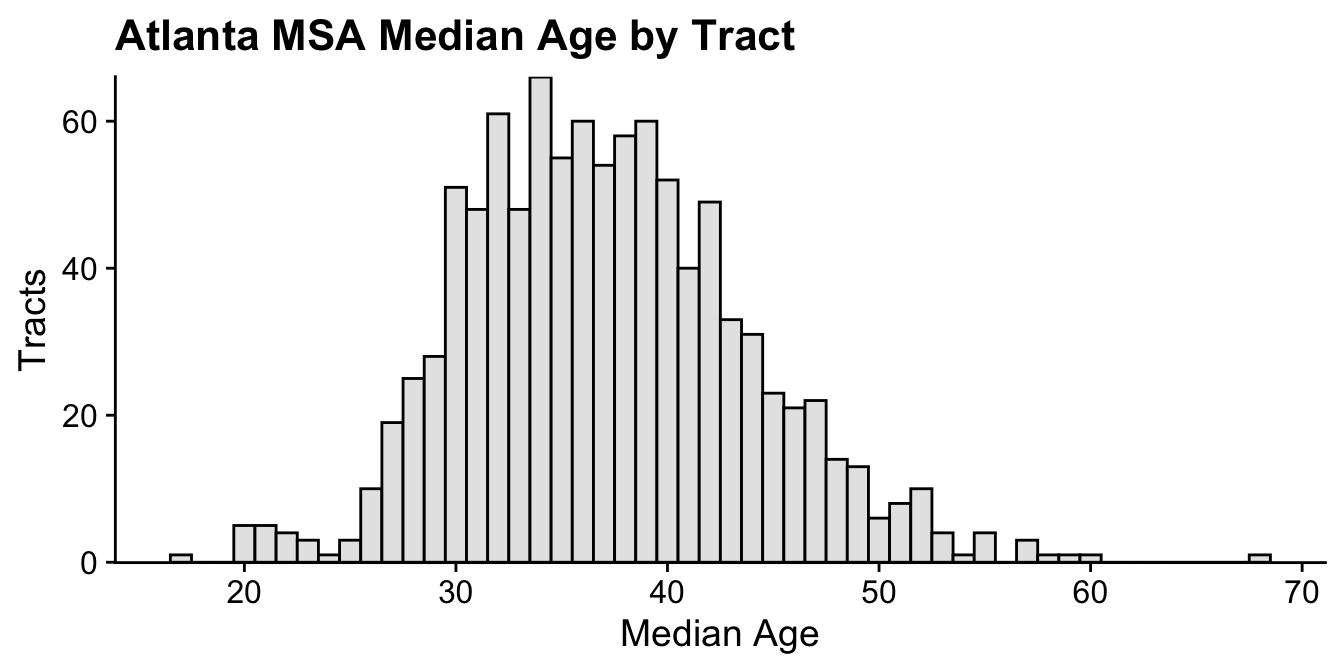
Intervals were cut using the “Fisher-Jenks” algorithm within the ’classInt` package.
5.2 Color
The colorspace package is used to generate the color palette.
5.3 Map
6 Key Points
mapviewwas designed for quick production and insight, not journal quality plots.it’s really, really fast when the package for rendering is
leafglormapdeck.when compared to
leaflet, the syntax is brief.the
zcolargument selects the variable(s) for plotting;burstselects all variables.styling includes basic options like
color,col.regions, andalpha.regions.the
atargument sets the intervals.